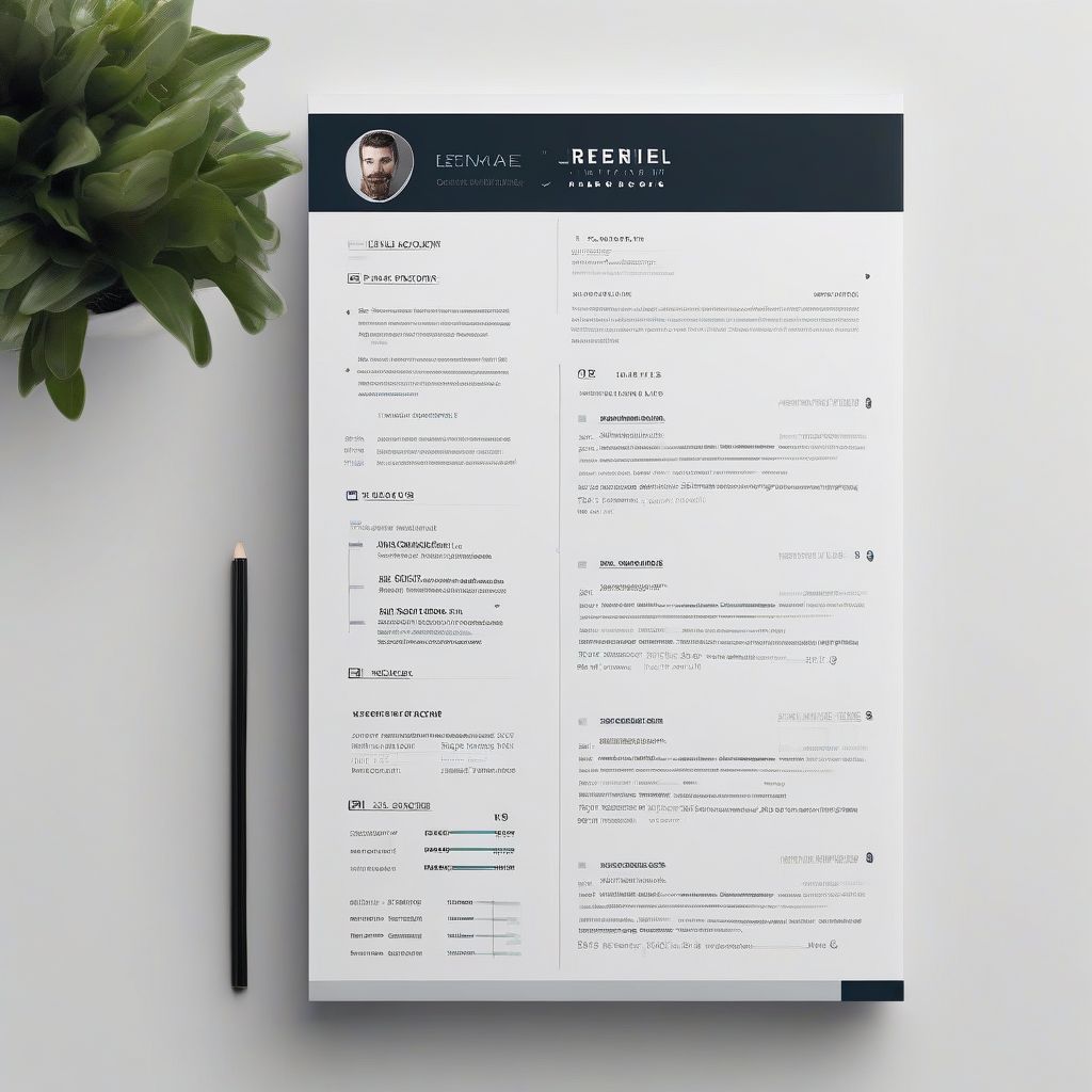
Imagine this: you’re a hiring manager with a mountain of resumes on your desk. Each one boasts similar skills and experiences. Which one are you most likely to choose? The one that’s easy to read, visually appealing, and highlights the candidate’s strengths effectively, right? That’s the power of a well-formatted resume. It’s not just about listing your skills; it’s about presenting yourself in a way that makes you stand out from the competition.
A professionally formatted resume is your secret weapon in the job search battle. It’s the first impression you make, and as we all know, first impressions matter. Let’s dive into why formatting is so crucial and how you can master it to land your dream job.
Why Formatting Matters: Beyond Just Looks
While content is king, a poorly formatted resume can make your impressive skills and experience invisible to potential employers. Here’s why formatting plays such a vital role:
First Impressions Count
Think of your resume as your personal marketing brochure. A cluttered, disorganized brochure won’t entice potential customers, and a poorly formatted resume won’t impress hiring managers. A clean and organized layout, on the other hand, immediately communicates professionalism and attention to detail.
Readability is Key
Recruiters and hiring managers often sift through countless resumes, spending mere seconds on each. A well-formatted resume makes it easy for them to quickly scan and absorb your key qualifications. Clear headings, bullet points, and a logical flow guide the reader’s eye to the most important information.
Highlighting Your Strengths
Strategic formatting helps you emphasize your most relevant skills and achievements. Using bold text, bullet points, and white space strategically draws attention to keywords and important details, making sure your accomplishments don’t get lost in a sea of text.
 Professional Resume Format
Key Formatting Elements for a Professional Resume
Now that you understand the “why” let’s move on to the “how.” Here are the essential elements of a well-formatted resume:
1. Font Choice: Keep it Clean and Professional
Choose a font that is easy to read both on screen and in print. Popular choices include:
- Times New Roman: A classic and professional option.
- Arial: Clean, modern, and highly readable.
- Calibri: A contemporary font that offers a balance between formality and personality.
- Verdana: Designed for on-screen readability, making it ideal for digital resumes.
Stick to one or two fonts throughout your resume and maintain a consistent font size.
2. Margins and Spacing: Finding the Right Balance
Appropriate margins and spacing prevent your resume from looking cramped or overwhelming. Use margins of 1 inch on all sides and incorporate white space strategically to create visual breaks and improve readability.
3. Headings and Sections: Organize Your Story
Clear headings and sections help organize your resume into easily digestible segments. Use a slightly larger font size for your headings and consider using bold text for added emphasis. Standard resume sections include:
- Contact Information: Your name, phone number, email address, and LinkedIn profile URL (if applicable).
- Summary/Objective: A concise overview of your skills and career goals.
- Work Experience: List your work history in reverse chronological order, including job titles, company names, dates of employment, and a brief description of your responsibilities and achievements.
- Education: List your degrees or diplomas, institutions attended, dates of attendance, and any relevant academic achievements.
- Skills: Highlight your technical and soft skills relevant to the jobs you’re applying for.
4. Bullet Points: Showcasing Your Achievements
Use bullet points to list your responsibilities and accomplishments under each work experience entry. Start each bullet point with a strong action verb and keep them concise and impactful. For example, instead of writing “Responsible for managing social media accounts,” write “Managed social media accounts to increase brand awareness and engagement.”
5. File Format: PDF is Your Friend
Save your resume as a PDF (Portable Document Format) to preserve its formatting across different computers and operating systems. This ensures that your resume will appear as intended when viewed or printed by the recipient.
Optimizing Your Resume for ATS (Applicant Tracking Systems)
In today’s digital age, many companies use Applicant Tracking Systems (ATS) to streamline their hiring process. These systems scan resumes for keywords and other relevant information before they ever reach a human recruiter. Here’s how to optimize your resume for ATS:
- Use Keywords Strategically: Carefully review job descriptions and identify relevant keywords (skills, software, industry terms) and incorporate them naturally throughout your resume.
- Avoid Fancy Formatting: ATS may have difficulty reading resumes with complex formatting elements, such as tables, columns, or graphics.
- Choose Standard Section Headings: Use clear and common section headings (e.g., “Work Experience,” “Education,” “Skills”) that ATS can easily recognize.
Common Resume Formatting Mistakes to Avoid
Here are some common formatting pitfalls that can send your resume to the bottom of the pile:
- Too Much Text: Avoid dense blocks of text. Use bullet points, white space, and headings to break up the information and improve readability.
- Inconsistent Formatting: Maintain consistency in font choice, font size, headings, and spacing throughout your resume.
- Typos and Grammatical Errors: Proofread your resume carefully or, better yet, have a trusted friend or colleague review it for you.
- Unprofessional Email Address: Use a professional-sounding email address that includes your name or initials.
- Irrelevant Information: Focus on the information most relevant to the jobs you’re applying for. Avoid including irrelevant hobbies, personal details, or outdated experiences.
Conclusion: Make Your Resume Shine
[amazon bestseller=”resume format”]
Remember, your resume is your first opportunity to make a lasting impression on potential employers. By following these formatting tips and avoiding common mistakes, you can create a professional, polished, and impactful resume that showcases your qualifications and helps you stand out in a competitive job market. Take the time to craft a resume that accurately reflects your skills and experience and presents you in the best possible light. Your future self will thank you.
